I wrapped the series of posts about how to embed visualizations in Salesforce applications with a Wednesday architect session at Dreamforce ’19 and a repeat architect session on Thursday comparing the various options.
Before diving into the content, I shared some of the use cases at Fair Trade USA.

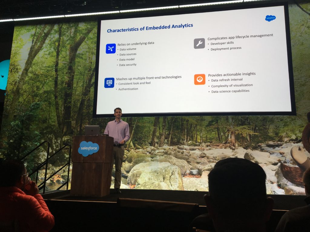
The session began with an overview of characteristics to consider when evaluating analytic solutions for an embedded use case.
The bulk of the content was a summary of the steps to embed visualizations in Lightning Experience using popular solutions. As a reminder, below are the solutions I posted about.
- Salesforce Reports and Dashboards
- Salesforce Einstein Analytics (product has since be renamed to Tableau CRM)
- Tableau: Lightning Web Components | iframe | Canvas Sparkler Connector | JavaScript API
- Qlik Sense
- Microsoft Power BI
Finally, I provided a summary of how the solutions compare. This is not a comparison of their strengths in general, but rather looking at how they compare when used for embedding visualizations in the Salesforce UI.
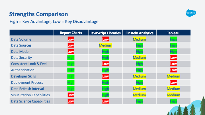
The first scenario – using report charts – is where most teams start.
If you find that you need more flexibility around how you present the information and you have access to developers, then JavaScript might be a good approach to consider.
If you need to be able to handle higher data volumes from multiple sources, then a BI system is the best approach. Einstein Analytics has a number of advantages over its competitors for embedding visualizations in the Salesforce UI.
If your company already has a BI implementation, such as Tableau, then it might make sense to leverage that existing capability to deliver the solution.


