This post is part of a series that is exploring the capabilities and limitations of various data visualization tools when embedded in Salesforce.
In the previous post, we used Qlik Sense to embed a dashboard on an Account record. Qlik Sense is a great product, but if your organization is already using Power BI, you will likely need to use Power BI to meet the need. Power BI Desktop is free and Microsoft provides generous donations to nonprofits for hosting Power BI content.
This is an example of how to use an iframe approach of displaying and filtering a Power BI report on record pages in Lightning Experience.
Prerequisites
- Power BI Desktop: available free for Windows users; download from the Microsoft Store.
- Access to Power BI Pro Service: you will need an environment where you can publish and host the Power BI dashboard online. Power BI Pro license is required to embed a dashboard in a web application, such as Salesforce. Sign up for Power BI Pro trial.
- Salesforce org populated with data you want to visualize; the example below uses data from the account and opportunity objects. You can create a free developer edition org that is pre-populated with data using this link.
Step 1: Create Report in Power BI Desktop
Open Power BI Desktop and click the “Get Data” button. Click “Salesforce Objects” and then the “Connect” button. If you need to connect to a sandbox instead of a developer or scratch org, click the “Custom” option and enter the sandbox login URL: https://test.salesforce.com.
Select the Opportunity object and then the “Load” button.
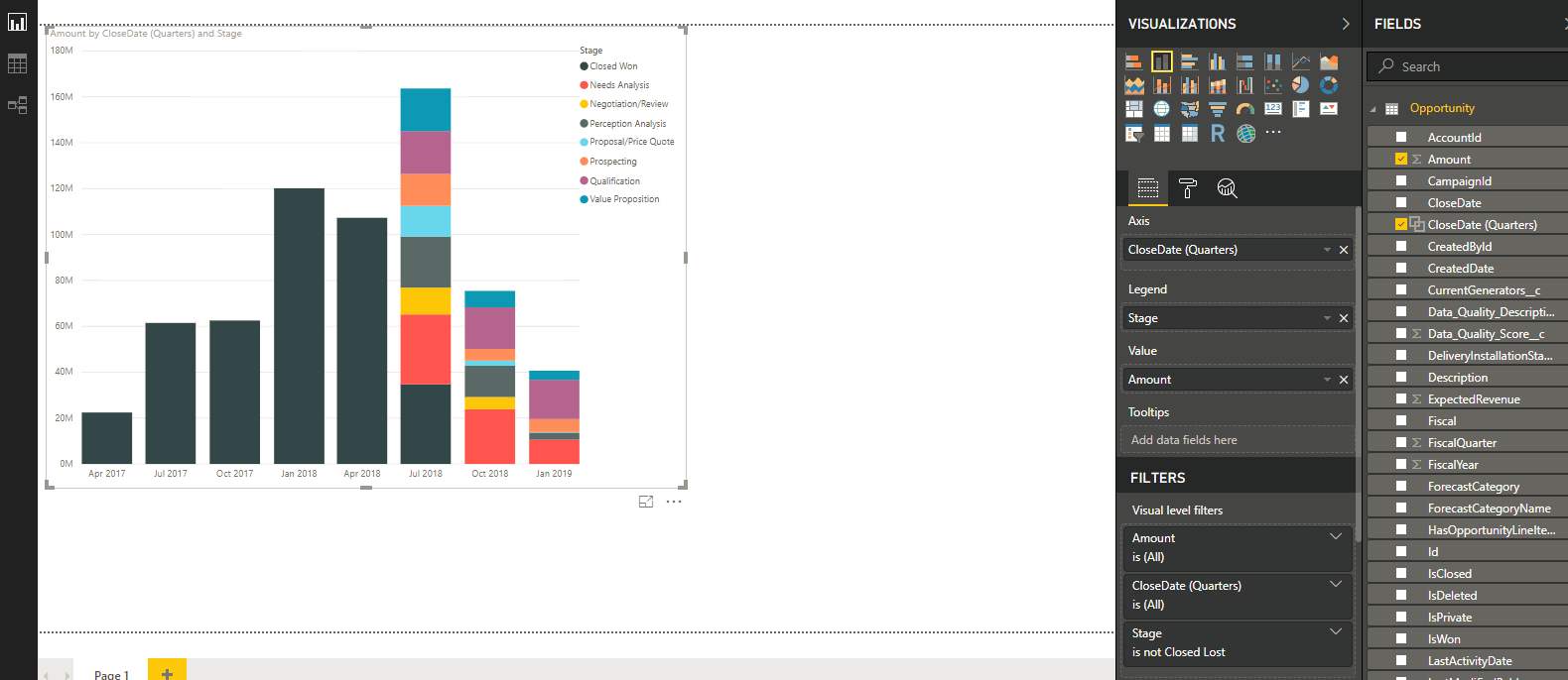
On the Report View you should see the Opportunities data set and list of fields on the far right pane. Check the boxes for StageName and Amount. Right click the StageName field and rename it to “Stage”.
Right click the CloseDate field and select “New group”. Set the follow parameters in the Groups popup:
- Name: CloseDate (Quarters)
- Group type: bin
- Bin Type: Size of bins
- Bin Size: 3; Months
Note: this approach will label the quarterly groups as January, April, etc. and the group display behavior is a little quirky when the report is embedded. I came across this idea to make displaying quarter names for the group a native feature and there are a number of workarounds to displaying the x-axis labels as quarters that I didn’t attempt.
Check the box next to the CloseDate (Quarters) field to add it to the chart.
In the Visualizations pane, select the Stacked column chart visualization.
In the Filters pane, leave the default filters, except for Stage: deselect “Closed Lost” and make sure the rest of the stage values checked.
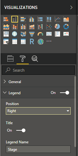
Click the paint roller icon to adjust the formatting. Change the position of the legend from the top to the right side.

Your chart should look something like this

Save the report and name it “Sample Revenue Pipeline Report.”
Step 2: Publish the Power BI Report Online
Click the Publish button in the ribbon on the home tab and sign in with your Power BI Service credentials. The account you use to sign in must include a subscription to Power BI Pro in order to be able to embed the dashboard.
Sign in to Power BI Service. Open the Sample Revenue Pipeline Report. Once the report loads, navigate to File -> Embed. Copy the link to use for embedding the content. We will refer to this link as [POWER BI EMBED URL] in the next step.
Note: The version of Power BI Desktop I used when creating this post was including a filter pane on the right side of the report when published to Power BI Service and embedded in Salesforce. I decided to enable the new filter experience in order to hide the filter pane.
Step 3: Embed and Filter the Report in Salesforce Lightning Experience Records
Next we are going to create a Visualforce page that displays and filters the report to only show pipeline data specific to the account record being viewed.
Create a new Visualforce page by navigating to Salesforce Setup, search for and open “Visualforce Pages”. Click the “New” button, enter “SimplePowerBIEmbed” for the name and check the box “Available for Lightning Experience, Lightning Communities, and the mobile app”. Replace the placeholder code with the code below.
<apex:page standardController="Account" showheader="false" sidebar="false">
  <apex:iframe src="[POWER BI EMBED URL]&$filter=Opportunity/AccountId eq '{! Account.Id }'" height="540px" width="100%" frameborder="0">
  </apex:iframe>
</apex:page>
Replace [POWER BI EMBED URL] with the link you copied in the previous step.
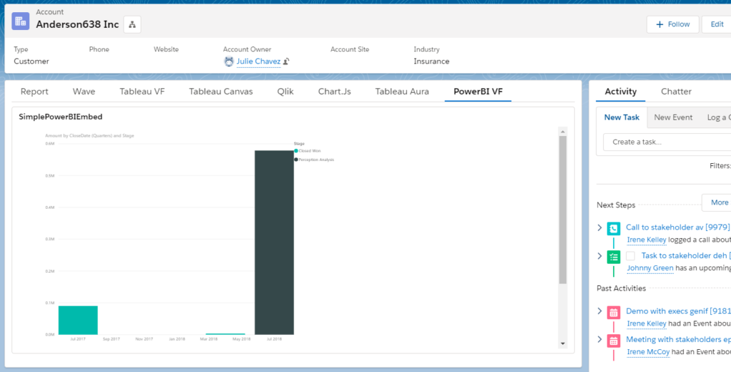
Next we will customize the Account record page to show the dashboard. Navigate to an Account record in your Salesforce org. Click the gear icon in the top right and select “Edit Page”. This will open the Account Record Page editor in the Lightning App Builder. Click the Tabs component, then the Add Tab button. Select “Custom” for the Tab Label and enter “Power BI” for the Custom Tab Label.
Click the “Power BI” tab, then drag Visualforce component from the list of Lightning Components onto the page. In the right pane, select SimplePowerBIEmbed for the Visualforce Page Name and set the Height to 400. Save the Account Record Page and then view an account record to see the filtered dashboard.

Summary
Advantages of this approach include:
- Effort and skills required: Power BI Desktop is a robust tool has a lot of similar UI features as MS Office. If you are savvy with Excel or other data manipulation tools, you’ll pick it up quickly. This approach also requires very little Visualforce knowledge, although I found the Power BI Service filter syntax not very intuitive.
- Multiple devices: Power BI Desktop provides a number of features for designing responsive layouts when creating content. This needs to be specified in Power BI, rather than in the Salesforce application. Custom record page tabs can also be created for the mobile layout, and Visualforce pages can be embedded in mobile cards or in page layouts and viewed in the Salesforce mobile app.
- Look and feel: There are a lot of chart types and options for customizing the styling and layout of charts and reports.
- Large data volumes: Power BI Service/Server can handle very large data volumes.
- Data sources: Power BI supports many connectors to various data sources and data formats.
- Data model: Power BI provides robust functionality for restructuring and enhancing the data model to support visualization needs.
There are some limitations with this approach
- Effort and skills required: While Power BI Desktop is fairly easy to use, Power BI Service/Server is part of the Office 365 application suite, which makes it a little more complicated to administer. If your organization is already using Office 365, then this is probably fine. If not, there will be a learning curve. Also, I found the documentation related to URL parameters and URL filters a bit limited and not very thorough.
- Accuracy of data: The flip side of being able to handle very large data volumes is that the data is not queried from the CRM in real-time. Data in Power BI content are updated periodically and do not return real-time data.
- Single sign-on: Assuming you do not already have SSO at your organization, this approach requires Salesforce users to log into Power BI Service/Server separately in order to view visualizations.
- Data security: Power BI typically aggregates data from source systems into a new data set within Power BI and any Salesforce data security settings, such as object and field level security and record-level sharing, are not transferred by default. If your data security model is pretty open, this might not be an issue. For other scenarios, especially embedding in external-facing application pages, re-creating the field and row-level security in Power BI could be a significant effort.
- Deployment process: Source data, reports and dashboards are created in Power BI Desktop, then pushed to Power BI Service/Server and live separate from the Salesforce platform. The process for creating/updating embedded content needs to be coordinated with the process for creating/updating the application page in which they are embedded.
Resources
- Microsoft documentation: Purchase Power BI Pro licenses
- Microsoft article: Embed Power BI Reports in a Website or Portal
- Microsoft documentation: Filter Reports with URL Parameters


I am looking for similar solution but without powerbi licenses . Meaning users of salesforce should not login to power bi but they should see the report embed in salesforce.
I am not sure but I think this is the case to use PowerBi Embedded
I am looking for the same
Hi-Thanks for the great article! I got a little stumped by the URL filter syntax until I found this article:https://docs.microsoft.com/en-us/power-bi/service-url-filters. Just wanted to share it in case others run into trouble.
I have build some report in power BI and want that in salesforce. no data is present in salesforce I just need to display the report in salesforce. can we do that? In this we can get data from salesforce build the report and then push back to salesforce but I need only some report from power Bi to go to salesforce.
Thanks for the article – very useful.
Using my Salesforce Dev instance I created a Visualforce page according to the steps in the article, clicked on “SignIn” when it appears which redirects me to the PowerBI sign-in page where I enter my details, which are accepted, however before the report renders I get a pop up message saying this:
Your Power BI session expired
The current Power BI session can no longer be used to communicate with the Power BI service because of a service modification. You must close and re-open your browser to start a new session.
Clicking Close takes me back to the Sign-In button. And the process repeats itself.
I’ve done a bit more testing on this and it looks like this happens when you are logged into a different O365 tenant in the same browser session. The solution is to use another browser or use an incognito / InPrivate window ….. neither of which are proper solutions. Any ideas for (reasonable) workarounds or fixes?
Hello,
the issue might also be that publishing online the report makes it accessible potentially by everyone. Is this correct?
Hello,
Has anyone else had an issue with duplicate IDs due to case sensitivity?
The 15 digit ID works on most account pages but I am having issues across some accounts.
For instance 170000DgeH112e5 and 170000DgeH112E5 are picking up that they are the same and making the report blank.
Does anyone have a solution for this?